Overview
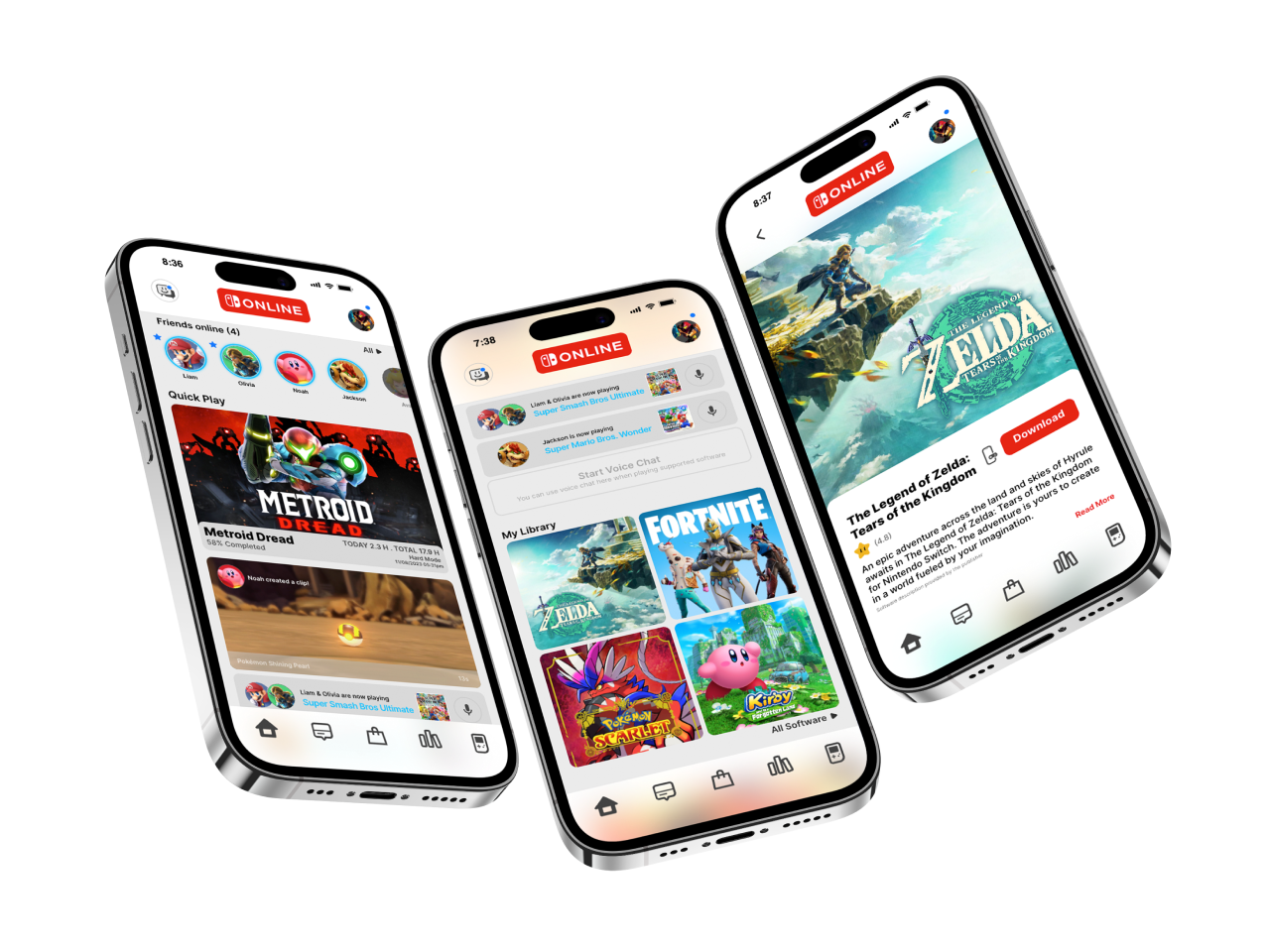
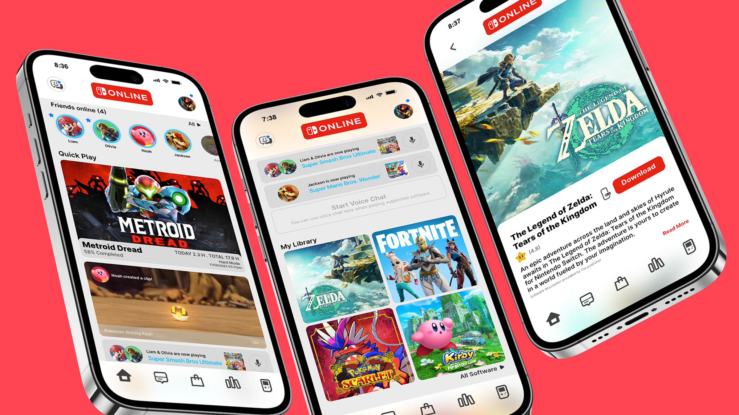
A self-initiated redesign of Nintendo's mobile companion app. I studied the legacy screens and years of user reviews to find where the interface gets in the way. The goal was clearer structure and easier interaction, while keeping Nintendo's warm, family-friendly feel.
The challenge
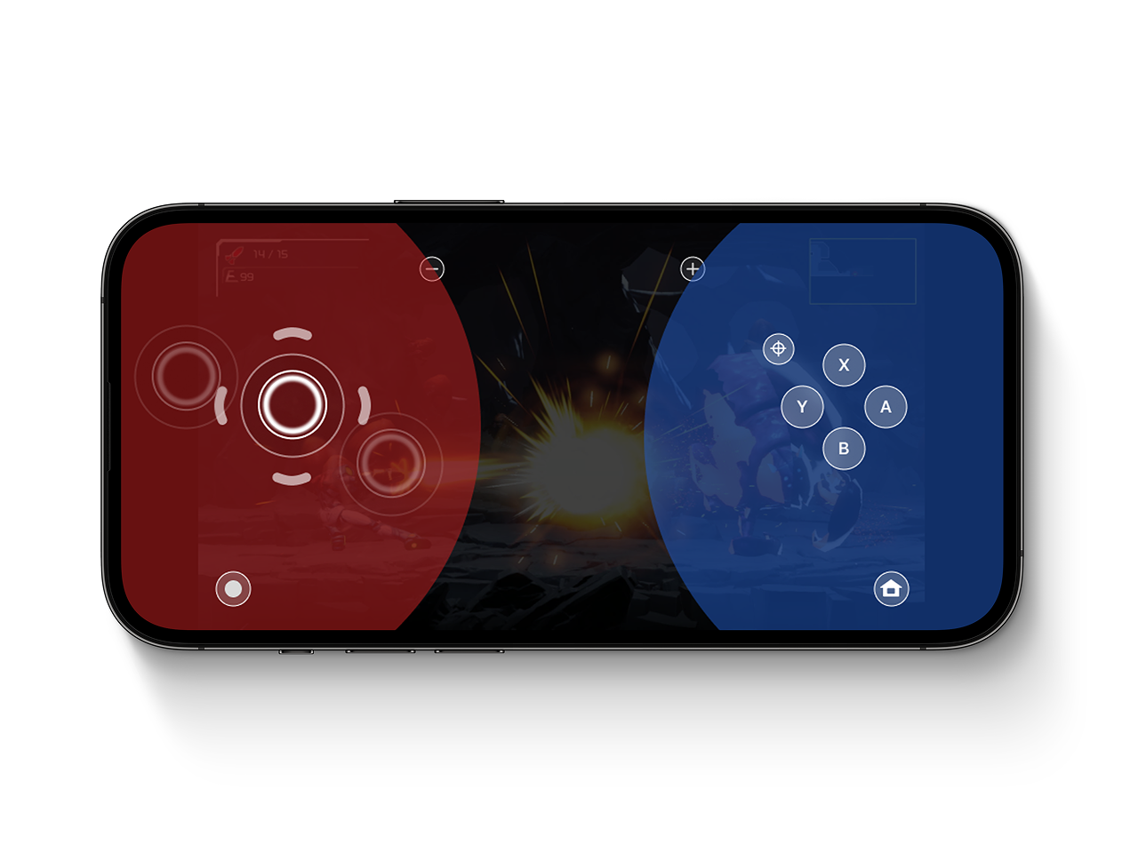
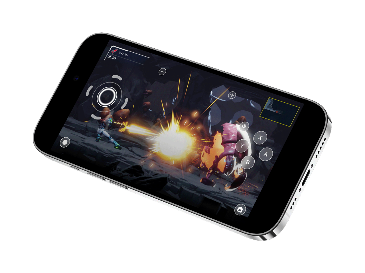
There were two problems to solve. The home screen has to surface friends, quick play, captures, party chat, the game library and news without overwhelming anyone. Cloud gaming also needs on-screen controls that don't cover fast action on a small phone screen.
Process
Low-fidelity wireframes borrowed from Nintendo's controller history:
- the Game Boy's simple D-pad
- the SNES's balanced button layout
- modern dual-stick ergonomics
I explored three wireframe variants. They became reusable blocks for achievements, friends, news and voice chat, set on a scalable grid. The high-fidelity design uses a documented system: primary #03A0FF, neutrals #272727 and #F8F8F8, and Helvetica Bold with Roboto for type.
Outcome
The home screen is one smooth scroll with clear priorities. Friends online and quick play come first, and the library and news are a glance away. In-game, the screen splits in two. The left side responds to the thumb wherever it lands, for movement. The right side holds fixed A, B, X and Y buttons. The layout follows Joy-Con ergonomics and keeps most of the screen free for play. Cloud saves and quick-resume make it easy to jump back in.