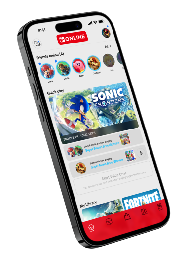
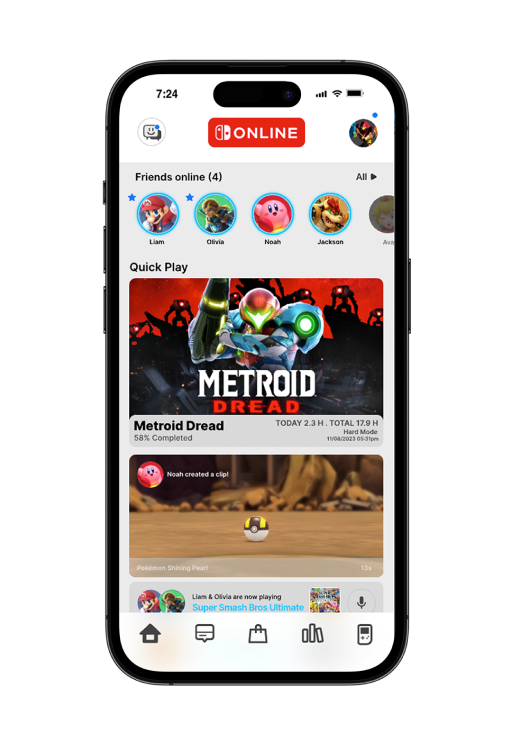
Capturing the Brand’s Essence
The redesign centered on infusing the companion app with vibrant, welcoming family-gaming energy—using bright primary colors, rounded forms, playful typography, and soft gradients to create a joyful, inclusive feel that brings people of all ages together. It emphasizes effortless social connection (see friends online, join sessions instantly) and seamless return to play through cloud saves and quick-resume, ensuring every interaction feels warm, shared, and full of life.
Vibrant Family Aesthetic — Bright colors, rounded elements, and gradients for playful warmth.
Effortless Friend Connectivity — Instant visibility and easy multiplayer joins.
Frictionless Return to Play — Cloud saves + quick-resume keep the experience uninterrupted.